
Tips for jersey design
This time of year everyone is scrambling to design new jerseys. If you’re smart, you’ll think this through very carefully. Here are a few things I’ve learned over the past few seasons.
|
The more you click, the more I can post. Lee Likes Groceries dot com! |
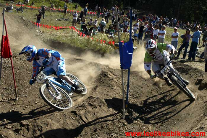
 These photos show Mountain States regional teams. Notice how they’re all different. Zach Griffith from Full Tilt Cyclery. |
Jerseys serve four purposes:
1. Team branding
If you’re a shop team, the jersey better look like the rest of your shop materials. You’re building a brand, and you oughta be consistent. Is your shop earthy, techy, hardcore, friendly? … Your logo, shop motif, banners and jerseys should all work together. If you want to make a major change, do it for a good reason.
2. Differentiation
Your team should stand out from the others in your market. If a key competitor is black and white, you probably want to use color.
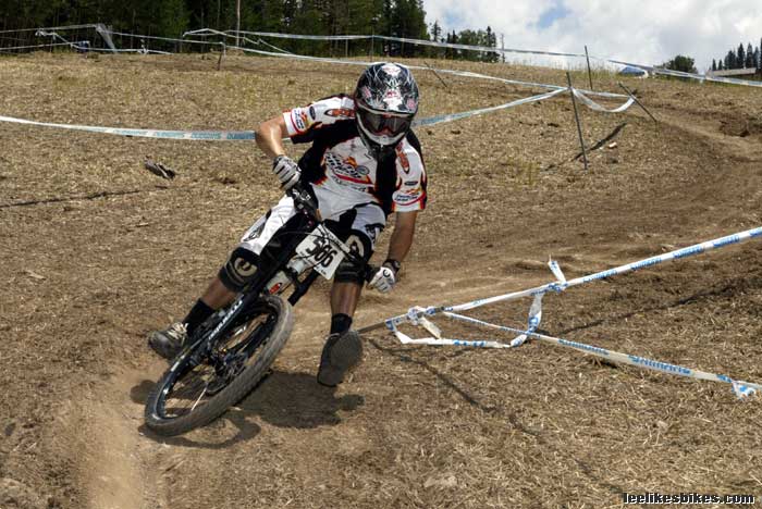
 Chris Boice, Team Orbit. Steve Wentz, Team Turner/Wahoos. |
3. Pride
You can’t design by committee, but your team riders should think the jersey looks cool. You want them stoked to wear it. As team manager, you should listen to input, but when the time comes be a man (or woman) and make the decision.
4. Media exposure
If you have sponsors, or if you’re trying to attract customers to a shop, you want to appear in print, online and in videos. This is key for a serious team.
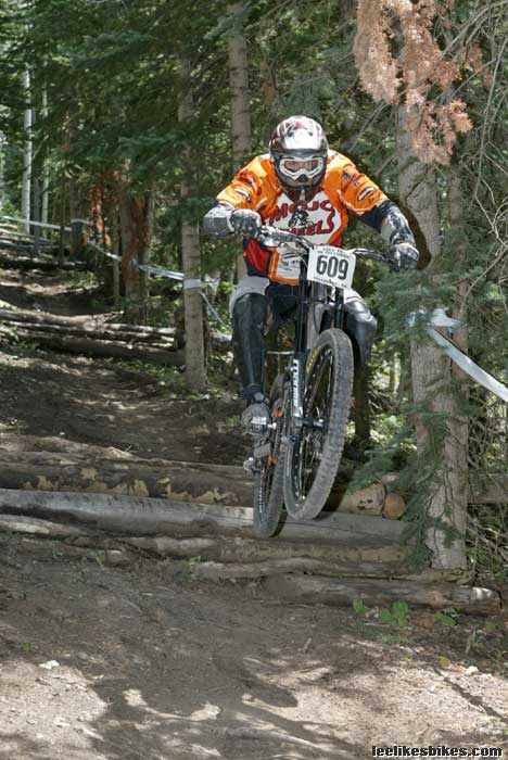 Troy Cooperman, Team Mojo Wheels. |
As Mountain Bike Action’s main photographer, John Ker has a huge say in which photos appear in the magazine. I asked him for advice on last year’s The Fix team jerseys, and he shared these insights:
Contrast. Your kit should contrast with everything: trees, rocks, dirt and sky. If you blend into the background, chances are your photo won’t be chosen.
Writing. Should be clear and legible.
Your chest should be light. Your underside tends to be in shadow, and dark colors get lost. Go for a light base color with high contrast writing.
Yellow. Super photogenic. It’s colorful and bright, and it stands out well.
Red. Great color. Yellow and red are a great combination.
White. Avoid large areas. The highlights blow out. White can be good for the chest. But it’s bad for your shoulders and back. It blends into the sky.
Black. Great for small parts like piping and writing. But it blends with shadows and looks invisible, so don’t use it on large patches.
|
Me, Team The Fix. People wanted to change the jersey for 2007, but this one accomplishes the four goals, so it’ll stay pretty much the same. |
Red and white with black. Works well if it’s done right.
Blue. Use caution. Dark blue looks like black and gets lost in many shots. Light blue — like a wimpy sky blue — tends to look lame.
Women. Tend to have a better color sense than men. Trust their opinion.
Ideas. Look in the magazines. If a photo appears in MBA, the jersey must be pretty good. Said John, “I’m looking through the magazine right now. Fox jerseys look good, and Yeti jerseys look good too. But the turquoise is kind of pale and blends in with the sky; it’s not as good as yellow or red.”
Ask. For people’s opinions. If they say they love it, ask them what they don’t like. No matter what they say, thank them and DO NOT get defensive. They’re helping you design a cool jersey — one that will appear in a major magazine.
Well there you go. I hope this is helpful.
BRAAAP!
— Lee
Comments are closed.