Would you wear this jersey?


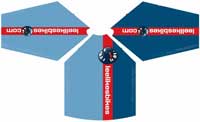
I’m ordering jerseys, and they’re expensive! The more I order, the less each one costs, and I’m trying to figure out how many people will want. How many of you fine folks would buy one of these?

Pricing will be about $75 each. I’m just trying to cover costs.

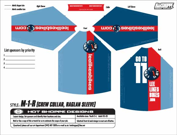
DH jersey – 3/4 sleeve


XC jersey – 3 pocket, loose fit


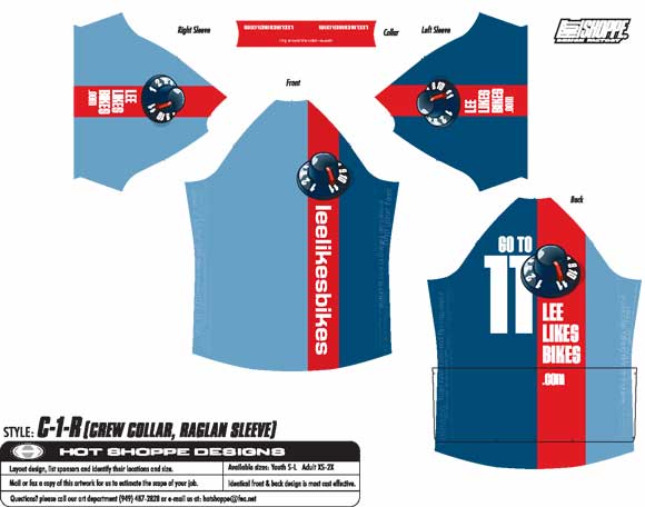
Detail along the seam

The jersey is full of useful/inspiring statements. They’re not immediately obvious, but they’re there.


Design by Sacha Halenda at Mayfire — a bad ass marketing company that serves the motorcycle and bicycle industries.

In the comments please say Yes, No or Maybe for the DH and XC style. Also tell me your size. If you have constructive criticism, let it fly.

Thanks for your help!

— Lee

22 replies
  1. chris says:

    Lee, I’m running IE V6 and the graphic is covering the text from “DH Jersey – 3/4 sleeve” to “Mayfire”. The text shows briefly until the graphic loads on top of it. I can juuust see the left hand edge of the text.

    Anyway, DH top maybe.

  2. Ryan says:

    Well Lee, you asked for the contructive criticism: I’m not a big fan of it. The knobs are kinda big and awkward looking (a giant nipple?), the knob at the bottom of your site is better. The giant 11 makes it look like you’re wearing number 11. I do like the statements, that’s unique.

    I’m having a hard time picturing more “icons” that you represent, besides the knob to 11. Which is cool, but I’m not a fan of it as the main graphic on the jersey. Why not just do a cool font/style thing with “LeeLikesBikes.Com” and have the knob hidden somewhere or strategically placed…kinda like on your website. I know you have different version of the LLB design, too. Why not on the jersey?

    I’m sure you’ve done this, but look at the jerseys that are hot nowadays. The TLD’s, the Fox’s, the Royal Racing, etc. Those are pretty sweet and fetch high prices. I’d love to support you, cuz I believe in what you do. But honestly the jersey could be better. Make those guys do more protos for you. Heck, contact Evan Chute, he’d probably be willing to exchange more classes for jersey designs with you.

    Keep up the good work!

    Ryan

  3. Jason says:

    Have to agree with Ryan, the knob pretty much takes over the jersey. Even if you go with this though, I’m in for a XXL DH jersey.

  4. PostCanyonLoc says:

    Replace the nob and I’ll order one up- XXL DH 3/4, because I’m not a knob, I just love Knobby Tires.

  5. Ed says:

    The knob does raise some interesting ideas though… how about a 16-inch Stonehenge tucked away in the corner? A graphicless ‘None More Black’ special edition? Some ‘Smell The’ Gloves for the dedicated fan? Or maybe get the thing printed in Dobly? The possibilites are endless!

  6. Julian says:

    Looks good … but I rekon it needs a big Braaap on the back! Maybe in place of the ‘go to 11’, I rekon that’s pretty obvious from the dial. I’d take a medium in either XC or DH.

  7. Michael LaFlow says:

    It’s missing the fun spirit of the site. I mean– the lines are all straight!!!
    Call me crazy, but if lee likes bikes, maybe the jersey should have a bike on it.
    I’d go for one if it had one of those ‘strobe’ photos from your book, of a rad move wrapping around front to back!

  8. Grant Shoemaker says:

    Right on, Lee. I think they look great. I disagree with the above comments about the knob and/or number 11 being too big and lines too straight. I like it exactly like it is. You can put me down for a Large DH. No thanks for the roadie jersey. 😉

  9. Josh says:

    I’d take a medium DH, but only with the awesome Go to 11. a big Braaap! up and down the sleeves would be great though. I mean that is your super hero catch phrase right?

    JOSH

  10. Bob Burnes says:

    Yes to the DH.

    The Critisim: I don’t like the design very much. The design is ho-hum and not what I’d expect from Lee. The back is cluttered and for me, who has to put my sponsors on my jersey, I’ve really got no place to put them unless their logos are so small, people would need to invade my personal space to take a gander at ’em.

    My Two Cents: Break the red from the blues with a thin sharp yellow pen stripe. Drop the “Go to 11” on the back. (The knob cranked over to the 11 already implies this).

    Put me in for a XL DH.

    Bob Burnes

Comments are closed.